pixels
graphics
blinkies
guide to html
tiny disclaimer  : i am not a professional web developer or anything. this is just a little beginner guide from me, written the way i wish someone had explained html when i first started fixing up my site.
html is basically the bones of a page and css makes it pretty while javascript makes it functional, but html is where you put the actual stuff like: your words, links, images, lists, buttons, sections & all that.
start here
html uses tags.
example<p>this is inside the paragraph tag.</p>
the browser does not show the tags. it reads them and shows the result.
this is inside the paragraph tag.
adding text
for normal writing, use paragraphs. do not put all your writing in one giant block unless you want it to feel like a wall.
two clean paragraphs look like this<p>first paragraph here.</p> <p>second paragraph here.</p>
first paragraph here.
second paragraph here.
headings are for titles and section names. they go from h1 to h6. most pages should only have one main h1.
<h1>my diary</h1>
<h2>july entries</h2>
<p>today i fixed my layout again.</p>
my diary
my january entries
i am thirsty...
you can also make words stand out without making a whole new section.
<p>i <strong>really</strong> like this song.</p>
<p>this part feels <em>very nice to hear</em>.</p>
adding links
links use the a tag. the text between the tags is what people click. the link goes inside href.
<a href="diary.html">read my diary</a>
<a href="https://neocities.org" target="_blank" rel="noopener noreferrer">neocities</a>
target="_blank" opens it in a new tab. rel="noopener noreferrer" is just a small safety thing people usually add with it.
adding images
images use the img tag. this one does not need a closing tag. you change the src to your image link.
<img src="images/luna.png" alt="my cat luna">
the alt text is a short description. it helps if the image breaks, and it is better for accessibility.
to control the size, give it a class and style that class in css.
html<img class="entry-img" src="images/example.png" alt="describe the image here">
.entry-img {
  width: 280px;
  max-width: 100%;
  display: block;
  margin: 10px 0;
}
when you have your own example image, replace images/example.png with the actual file name or image url.

making lists
use ul for a normal bullet list. each item goes inside li.
<ul>
  <li>feed luna</li>
  <li>go to uni</li>
  <li>update my site</li>
</ul>
- feed luna
- go to uni
- update my site
use ol like steps in a tutorial.
divs, spans and sections
these are containers. they are not really “visible” by themselves, but they can help you group things so then the css can style them.
div is a block container thats good for cards, boxes, sidebars & layouts.
span is an inline container. it's good for styling a few words inside a sentence.
<div class="diary-card">
  <h2>july 1st</h2>
  <p>i worked on my site today!</p>
</div>

<p>this is a <span class="soft-word">sweet</span> word.</p>
classes
classes are how you point at something from the css. you add the class in html, then you style it in css with a dot.
html<p class="tiny-note">last updated 07/01/2026</p>
.tiny-note {
  font-size: 11px;
  color: #7a6a59;
  letter-spacing: 1px;
}
this is how you can keep your html neat instead of adding messy style stuff to every single tag.
a basic html page
this is the skeleton i would start with for a new page you can paste it into a new .html file, then start replacing the inside with your own stuff :)
<!DOCTYPE html>
<html lang="en">
<head>
  <meta charset="UTF-8">
  <meta name="viewport" content="width=device-width, initial-scale=1">
  <title>page title</title>
  <link rel="stylesheet" href="style.css">
</head>
<body>
  <main>
    <h1>my page</h1>
    <p>write something right here.</p>
  </main>
</body>
</html>
tip: if your html says href="style.css", then your css file really needs to be named style.css and be in the same folder!
some silly little mistakes that break stuff
- forgetting the closing tag, like opening
<p>but never closing it with</p> - putting image files in the wrong folder, then wondering why they do not load
- using curly quotes from notes apps instead of normal quotes in code
- forgetting the dot in css classes, like writing
tiny-noteinstead of.tiny-note - changing a file name but not changing the link to match it
guide to css
css is the part that makes your html look like your site. html is the notebook page. css is the color, borders, spacing, fonts, hover effects everything 
start here
css is made of rules. each rule says: “find this thing on the page, then style it like this.”
a css rulep {
color: #4e3b32;
font-size: 14px;
}p is what you are styling.color is what you want to change.#4e3b32 is what you change it to.the
; ends that line.connecting your css
neatest way is to keep your css in its own file, like style.css, and link it in the head of your html. (i personally don't but it's cause i'm crazy don't be like me)
<link rel="stylesheet" href="style.css">
that means: “browser, please load the file named style.css and use it to style this page.” if the file name or folder is wrong, the css will not show up.
my-site/
  index.html
  style.css
  images/
    luna.png
selectors
selectors are how css knows what to style. you can style every tag, one class or one specific id.
common selectorsp { }
/* styles every paragraph */
.diary-card { }
/* styles anything with class="diary-card" */
#main { }
/* styles the one thing with id="main" */classes are usually the most useful. they are reusable, so you can have lots of little cards or notes that share one style.
#special-boxgood for one thing only.
.soft-boxgood for many things.
colors + backgrounds
color changes the text color. background or background-color changes what sits behind it.
body {
  color: #4e3b32;
  background: #fefae0;
}

.note {
  background: rgba(195, 168, 127, .18);
}
rgba is nice because the last number controls transparency. .18 is faint, .80 is much stronger.
fonts + text
for fonts, you can use basic system fonts or load your own with @font-face. for normal writing, keep it readable. save the fancy fonts for titles, labels, and small accents.
@font-face {
  font-family: "mycoolfont";
  src: url("fonts/mycoolfont.ttf") format("truetype");
}

h1 {
  font-family: "mycoolfont", monospace;
}.tiny-note {
font-size: 11px;
line-height: 1.4;
letter-spacing: 1px;
color: rgba(78, 59, 50, .66);
}spacing: margin vs padding
this part confused me for ages, so here is the easy version: padding is space inside the box. margin is space outside the box.
.entry {
  padding: 12px;
  margin-bottom: 18px;
}
padding gives the text breathing room inside its own area.
margin pushes the next thing away.
boxes, borders & shadows
soft box.soft-card {
background: rgba(255, 255, 255, .12);
border-left: 2px solid rgba(96, 108, 56, .35);
padding: 10px 12px;
}layout: flex and grid
flex is good for things in a row or column. grid is good when you want a proper layout with columns.
.nav {
  display: flex;
  gap: 10px;
  flex-wrap: wrap;
}.layout {
display: grid;
grid-template-columns: 160px 1fr;
gap: 18px;
}when you are lost.. just start simple. one column first, then add the fancy layout after the content works.
hover effects
:hover styles something when your mouse is on it. tiny hover effects make a page feel alive without being annoying.
a {
  color: #4e3b32;
  border-bottom: 1px dotted rgba(78, 59, 50, .30);
}

a:hover {
  color: #606c38;
}
you can also animate it a little with transition.
.button {
  transition: transform .15s ease, opacity .15s ease;
}

.button:hover {
  transform: translateX(2px);
  opacity: .8;
}
making it work on phones
media queries let you change css when the screen is smaller. this is how you stop your layout from being cute on laptop but hella cursed on mobile.
basic phone rule@media (max-width: 700px) {
.layout {
display: block;
}
.sidebar {
margin-bottom: 16px;
}
}the usual move: desktop can have sidebars and columns. phone should usually stack things vertically.
css playground
mess with these controls & watch the card change!
little note
this card is styled by css. change the controls & steal it if you'd like. play around!!
little css mistakes that make you lose your mind..
- forgetting the dot for a class like writing
diary-cardinstead of.diary-card - forgetting a freaking semicolon
- styling
#mainwhen your html actually saysclass="main" - putting css in
style.cssbut linkingstyles.cssin your html - making the text and background way too close in color, so it looks pretty but.. hurts to read
- adding too many borders everywhere. like sometimes a left border or dotted underline is enough
code resources
places i would keep open while coding.
tutorials
more coming.. i hope
chords
this is mostly for me, but if anyone needs it anyways, here you go.
links i actually use + songs i keep coming back to.

source: acousticmusictv.blogspot.com
for making guitar and uke chords.
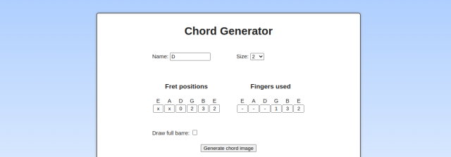 quick chord diagram generator
for checking guitar chord shapes.
songs i like playing chords on guitar
credits
sources + notesfonts
morningtea, spirit, kiwisoda, DOS, Ktegaki, and any other fonts here belong to their original creators.
data bloom / rob farmer
the soft generative flower animation used on my 404 page, shrines page, and resources page is credited to rob farmer’s data bloom, 2025, featured via
it’s nice that.
pixels, blinkies & graphics
most of the tiny pixels, blinkies, favicons, and graphics here are collected from old web/resource sites. they are here as a little toybox/archive, not as my own work.
places i collected from
cloudcover /
artwork /
pixelbank /
nukochannel /
favicons /
pixelsafari /
pixels /
biscuit /
biscuit2 /
gifcity /
twst /
yokai /
autism /
enchantments /
cinni /
lejlart
#small note
if anything here belongs to you and you want it removed or credited differently, please let me know.